Monday, 7 November 2011

Initial Research: Archan Nair

Archan Nair

Eyes Wide Open -  Archan Nair

Archan Nair is an illustrator and visual artist that experiments primarily with colours, and pattern techniques, and what emotions art can conjure with what seems to be people's imaginations. Each artwork seems to tell a story. 
In the above piece the background seems roughly painted, with dark purples and greys, fading to lighter colours, eventually to yellows and creamy whites. On top of this rather basic beginning begins a multitude of colours, rather abstract, blunt - clashing with the background, as they look digitally done. Another interesting part of the artwork is the detailed model of the girl, wistfully looking at the colours from her colourful perch. Although nearly in the centre of the piece, the girl is drawn looking away from the viewer and instead to the shapes and colours, which makes the work focus more on the abstract colours as well. The subtle way this is done whilst still demonstrating the girl as a main part of the artwork is very well done, and Nair demonstrates this technique throughout much of their work. 


Yuthika - Archan Nair


Nair's official website:
http://www.archann.net/

Websites: Using Patterns and Textures

Patterns and Textures in Web Design

To stand out to viewers, it is important in website design to create a website that will stand out and stick to people's memories. However, it also cannot be too bright or 'loud' - it is a thin line that website designers must balance upon when working. Today I researched websites that used patterns and/or textures in their design, and those that did not. 

Hot Topic


The American clothing store Hot Topic uses a faint patterned texture on its main website home page, so I am using it as an example for a website that does use patterns and textures in its design. In greys and dark shadowing, it represents its mainstream gothic-chic style that it sells. In my opinion, it works well for the website as empathasis should be on the merchandise; the design works well and looks well-finished, but does not take attention away from the site's main purpose.


Coldplay


Coldplay is a British alternative-rock band, and this is their main site. Although their use of typography and colours on a dark background is eye-catching and unique, unfortunately they do not use any patterns or textures in the background design on their website. However, I still feel their design is effective for being memorable and yet still pleasant to the eye.


Foo Fighters


This is another example of patterns/textures being used in website design, this time from the rock band Foo Fighters main band page. Using a heavily edited photograph distinctly against a dark background, it creates a striking pattern through the whole of the design.


Koda Kumi


An example of patterns/textures in website design, this is the Japanese singer Koda Kumi's main website in promotion for her single Love Me Back. The heavy plaid texture with the strong bright colours works well as it lays itself out over the page, with the colours matching the colours of the banner as well. It follows the theme of the single and although the colours clash, they work well together as a design. 

Research: David Carson

David Carson


"Carson was perhaps the most influential graphic designer of the 1990s. In particular, his widely imitated aesthetic defined the so-called "grunge typography" era." - TED


This piece of his work was used through a combination of photography, digital effects, layering, collaging and the use of typography. There is black and white and sepia toning used throughout, giving it quite a haunted feel especially with the harsh shadowing on the photographed hand. The large typography at the top of the page draws your eyes to his name, whilst the smaller typography acts more as a clever affect and works with the colour scheme he chose.


This piece is another combination of photography, digital work and typography. The words are blurred and slightly distorted, clashing with the man's calm expression in the background. The typography curls around him, as if it's something personal to that person. Instead of sepia, the whole tone of the work is defined by the dark shadows and reds, which give it a morbid feel.


In stark black and white with minimal shadowing, this is work that is a mix of drawing/photography, typography and layering of images. The black, thick text stands out bluntly from the mostly white face, making sure the title stands out accordingly. It's a very striking piece of art.

Carson's work is based around making a statement with both typography and images, each carrying a different message which leads to the same conclusion. His work is usually in bleak tones, with blacks, whites and sepias being commonly used with rarely a splash of bright colour. Personally I'd find it interesting if he experimented more with colour and textures. That aside, I find his techniques interesting, especially the first piece of work I have talked about here. 


.


Inspired by the above pieces, I have created my own face in text. 


Monday, 10 October 2011

Banksy Research: Studying Graffiti

Banksy


Banksy is an infamous graffiti artist, his street art combining dark humour with political statements. His shot to international fame when he 'attacked' the Israeli wall in the middle of a climatic war; his art hit headlines, and his drawings were suddenly noticed by all in the art world. 

Israel Wall - Banksy

Consumer Jesus - Banksy


This is a piece of graffiti art from Banksy, depicting the religious figure Jesus Christ holding presents, symbolising Christmas - and how commercialism had twisted what "Christmas" was all supposed to be. It's a good example of how Banksy represents his opinions on the world today through his art, and to then share it openly with the public from behind a shroud of mystery. 
I've been a fan of Banksy's work for a long time, and this piece is one of my
favourites. 
For this Banksy used stenciling, paint and editing digitally or through layering with materials to get this final piece. 


This piece is a family worshipping the brand Tesco; Banksy's humour showing again as to how many working class families depend on shopping deals and sales as families used to depend on religion or politics - and now they're more bothered about their daily shopping than their country and the decisions being made that will effect them by politicians and religious organisations. 

Banksy Research: Exit Through the Gift Shop {documentry}

Exit Through the Gift Shop


A documentary-style film that gives a unique insight to the beginnings of street art; from Los Angeles, France and the U.K.
Using edited footage from a street artist named Mr. Brainwash, who started his career by first filming street artists for years - and then finally, from his experiences with the street artist Banksy, decided to take to the art scene himself and set himself up with his own gallery. Exit Through the Gift Shop follows "Mr. Brainwash"'s story as he develops from amateur film-maker to a street artist making millions. 

Through the documentary, we see how street artists create their work, and the reasoning behind some of the most famous pieces from known street artists today. Cutting paper and making stencils, using spray paints or just slapping paint onto their chosen piece of wall in their city, there was numerous ways for an up-and-coming artist to make their work. 


Different Trends

Most artists that he followed followed the "repetitive trend", creating a character of sorts and placing their character in as many eye-catching places as possible around their city or town. The harder the location was to get to, the more people wanted to get to it. 
Obey - Shepard Fairey

One of the most famous examples of this repetitive trend was the character created by Shepard Fairey (above), usually accompanied by the word "OBEY". Fairey stated in the film that he liked the idea of people seeing this face and statement everywhere, and wondering what it meant - talking about its origins and spreading the word of his art just through that one, recognisable face. 

How it began..

Mr Brainwash's cousin is who introduced him to the street art phenomenon in 1999. Naming himself "Space Invader", he created space invaders from Rubix Cubes and would glue his creations wherever possible, to be seen and talked about.  
Space Invader

Intrigued by the danger and mystery surrounding the street artists of L.A, Mr. Brainwash - then known by his real name, Thierry Guetta - became obsessed with documenting every move Space Invader made whilst creating and then "publishing" his work. A few months later, he would go on to film other street artists, and eventually he met Fairey - who would eventually lead him to the biggest street artist in the world, at the time and even now - Banksy. 

When eventually after years of documenting Guetta decided to become a street artist himself, he used thick stencilling, photocopying and spray paint mostly to create his gallery Life is Beautiful.

Monday, 3 October 2011

Initial Research

Digital Art


Jonathan Foerster's work is very unique and digital-based, using splash colours and vivid styles to create eye-catching pieces.
- Very modern, abstract and intense. Using the dark background at the back, with the stripes and almost cuts of bright colour over the piece keeps a sharp, contrasted look.
- Although Foerster is also a traditional artist, he is best known for his digital work.
- As this was mostly created using the program Photoshop, he probably used many different tools available through it - such as the blur tool, to soften the edges of certain colours to bring your attention to other parts of the painting.
- I can imagine he used filters and layering techniques, over the dark background to create depth. The purple 'mist'-like effects are probably a stamp tool or something similar with the opacity turned down, so the two layers compliment eachother rather than clash. 


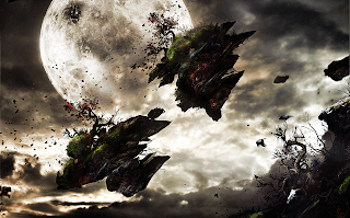
This artwork is another example from Foerster, which takes focus away from abstract and more to to creating an atmosphere. I can imagine once again the technique layering has been used, to combine the three different images - the moon, the clouds and the floating island - together to make a polished, complete piece. The contrast between the dark shadows of the breaking island and the brightness of the moon and clouds shows that he probably edited the lighting of separate layers and parts of the artwork through Photoshop, using Brightness settings and Contrast. 
Unlike the last piece, I doubt much stamp tools or blurring has been used; blurring may have been used on the clouds to soften their colours together naturally, but it is not used as much as in the first piece. However, although very different both pieces are still very dramatic. I think this is down to the clever use of lighting and balancing a sharp contrast between light and shadow, despite the difference in the use of colour. This second piece is almost in sepia, apart from the light breaking through the clouds and the full moon, whilst the first piece seems to revel in using every colour together and making it work in an explosion against a dark canvas. 
I think the way the second piece is also skewed onto its side also gives it a more disorientating view, giving more emotion to what is happening in the piece, more movement. This was probably easily achieved in Photoshop by using the angle-adjusting tool, or Free Transform. 
The colours in the second piece are also interesting, to how the green shades in perfectly to the grey in the background. The gradients of the colour wheel he has used here is perfect, which really adds to the realistic feel of the piece.

Traditional Art


This traditional art piece was drawn by an artist named Anthony Christian. All his work is created using traditional means, and none of his portfolio has been edited by any digital programs. 
This particular piece looks painted, as is his speciality. The use of colours against her face and clothes to create the shine of light against her works very well, with the background just shade darker than her skin to create that needed contrast of shadow. The portrait is as long as she, giving total focus to her as she fills the portrait; however, the focus is not directly in the centre, but to the right of the view. This gives a more casual, candid look and gives the painting a relaxed atmosphere, helped by a realistically content expression on her face. The shading on the artwork is soft and blended neatly, giving no sharp contrasts or lines in the work - once again adding to the gentle atmosphere. 
The colour techniques here are subtle, but very effective. There is not a huge range of different colours here, the one colour that stands out is the light-blue of her turban. This is a welcome smear of colour, giving a splash of life and depth to the painting. 

Initial Research II


This piece of artwork was created by an artist named David Frankland, to be used as the cover art of 
Mortal Engines.
Using a distinct style influenced by traditional media and steampunk, the bright colours of the background clash with the steely, dark colours of the objects - and people - in the foreground, making for quite an exciting, intense piece of art that perfectly represents the story within. 
Personally, I am interested in the steampunk style and loved the combination of two very different artistic styles here, that end up complimenting each other very well. Although the skies seem to rushed and vivid, as if to capture the emotion of the a sunset, the foreground images, although more detailed, seem also painted with movement in mind. I think this is what makes the art complete and stops the clash of colours feeling so abrupt.
This inspires me to continue research into artists who prefer to experiment with different styles and how they can work together in one piece of artwork. 


This particular piece is one of my all-time favourites, a traditional painting by the acclaimed artist and concept designer, Lucas Graciano. Working on such big names like Warcraft, Graciano now spends most of his time teaching his skills to his students whilst still winning awards with pieces like Silverwing.
I do love fantasy-style artwork, but I also love those that recreate an old tale so passionately. Although done in mostly soft blacks, blues, yellows and browns this painting stands out from most of Graciano's other pieces. One of my favourite parts about this is the unique cloud shapes, and how they almost form dragon spikes, or towers of flame. I think the way that every aspect of Graciano's artwork is thought about to link back to the same basic idea he had when he started, is something I will try and incorporate in my later work. I feel this technique leads to a very polished final piece, as well as giving more depth to something that could otherwise be uninteresting.
Also, the anatomy of Silverwing is spot on and the raw power of the focus in this artwork is impossible not to notice. Graciano has perfected his craft, of creating emotions and a storyline through his work. The fact he insists on still using mostly traditional art methods to complete his work just commands even more respect, in a gaming industry dominated by the digital takeover.


The above 3D piece is by a steampunk artist named Kris Kuksi, who has gained attention in the steampunk genre for years, being mentioned in such media as The Art of Steampunk. His rather detailed warships - like above - were showcased in the book. Kuksi deals mostly with 3D imagery and creating his ideas out of the materials around him, following the steampunk style avidly. He also concentrates on making religious statements out of his work, which has caused a little controversy in the past.
Although I have never worked much with 3D, I cannot help but feel inspired by the sheer work and dedication put into making one of his steampunk warships. The sheer genius it takes to design such a thing to such detail, and then to create every single part, has led me to learn more about the steampunk genre. The steampunk genre is all about the detail, and research into the pseudo-Victorian era of the 1880's to the 1920's, which is where steampunk stems from, and the more favoured pieces in steampunk are from artists who take their time with detail, from cogs and laptop pieces to the 3D works of art that Kuksi specialises in.
Although Kuksi also does digital artwork, I felt his 3D artwork is what I admired the most and wanted to showcase him for in my research. 

Materials

Experimenting with Digital Photographs


This is my first attempt to make a 'collage' of sorts with the photos I took outside today. Using Photoshop, I have combined a few of the photos to make the final outcome look interesting. The brief was to create a design for a poster advertising Astor Park. I'll have a few more attempts before deciding on a final piece.


Some of the photos I used in my first attempt are:


The techniques I used, included feathering, editing the opacity, editing colours and using the tool Curves to edit light and shadow on a photograph, or parts of a photograph. 


Attempt 2


Here is my second draft at creating an A4 poster for Astor Park in Plymouth.
Using my own photographs once again, I have this time used more experimental techniques to
create a more finished and interesting look than my first one. 


This picture of graffiti, I used in the background of the piece to insert more colour and depth, as it was looking too black and white, and dull, at the time. I used the tool Free Transform to edit the angle and the size, and used Opacity to fade it into the background, and moved the layers so it was behind the others. 


This is a screenshot of the piece when I was just starting. The background texture is 
a photograph I took of stone in Astor Park. The centre image is a sign for the park with a friend stood behind it, to show the social aspects of the park and to add more colour to the grey sign. I edited the picture, so the person is half in colour, with the sign in contrasting black and white.


This is the original picture without any black and white editing or layering. This is the picture I started with before adding more photos and layering later on. 

Techniques

Pattern-Creating in Photoshop

We had to copy this picture of cabbage from Moodle.
Entering Photoshop, we decided to use this to create pattern in text. 

This is the cabbage picture after cropping, adjusting hue and saturation to a more cyan shade, and then putting some simple text over the image. I also lowered the opacity so the shapes of the cabbage leaf showed through the text layer.

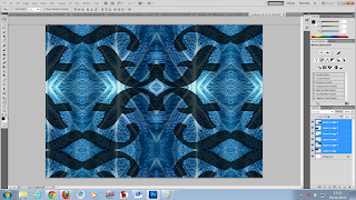
This is during the process of duplicating the image layer into another document of A4 size and resolution. After duplicating the layer I would flip the image horizontal to create an adjoining pattern. 


This is the image layer after duplicating the layers and creating the background pattern. I also changed the hue and saturation again and used curves to highlight certain parts of the piece to make it more interesting. 

I then put some text, and copy/pasted the pattern I had created within the text, creating pattern-text as I had set out to do. 

Other patterns I created:


Apples


Quick Mask Mode


Today I learnt how to erase the background of a picture, but keep the smaller details of the foreground - such as the hair in the photo above - in the art piece.

In Photoshop, I open the picture and then enter Quick Mask Mode, via a button at the end of the toolbar on the left of the screen. Making sure that I have selected the brush tool, and that black is the foreground and white is selected as the background colour, I can "paint" over the parts of the picture I want to save. These parts should turn red. 


After covering the parts of the picture I want to save, I then exit Quick Mask Mode, go into Select and inverse the selection. This means the parts I do not want are now selected. 
After this, I go back into Select and this time, choose "Refine Edge...". This brings up a window with many different options for me to choose. 

After editing the feathering, opacity and smoothing of the edges in the picture, I end up with this final piece - the original picture, with details such as the hair intact, with the background removed.


This means I can later change the background to whatever I want in a piece. I did a quick example where I changed the background of this piece to a light green. 


After this task I tried more work with Quick Mask Mode, to edit out the background of a piece of photography I had taken at Astor Park. 


This screenshot shows the window of options that "Refine Edge..." brings up from the Select tool.


After I had removed the background, this is the picture I was left with.