Digital Art

Jonathan Foerster's work is very unique and digital-based, using splash colours and vivid styles to create eye-catching pieces.
- Very modern, abstract and intense. Using the dark background at the back, with the stripes and almost cuts of bright colour over the piece keeps a sharp, contrasted look.
- Although Foerster is also a traditional artist, he is best known for his digital work.
- As this was mostly created using the program Photoshop, he probably used many different tools available through it - such as the blur tool, to soften the edges of certain colours to bring your attention to other parts of the painting.
- I can imagine he used filters and layering techniques, over the dark background to create depth. The purple 'mist'-like effects are probably a stamp tool or something similar with the opacity turned down, so the two layers compliment eachother rather than clash.

This traditional art piece was drawn by an artist named Anthony Christian. All his work is created using traditional means, and none of his portfolio has been edited by any digital programs.
This particular piece looks painted, as is his speciality. The use of colours against her face and clothes to create the shine of light against her works very well, with the background just shade darker than her skin to create that needed contrast of shadow. The portrait is as long as she, giving total focus to her as she fills the portrait; however, the focus is not directly in the centre, but to the right of the view. This gives a more casual, candid look and gives the painting a relaxed atmosphere, helped by a realistically content expression on her face. The shading on the artwork is soft and blended neatly, giving no sharp contrasts or lines in the work - once again adding to the gentle atmosphere.
The colour techniques here are subtle, but very effective. There is not a huge range of different colours here, the one colour that stands out is the light-blue of her turban. This is a welcome smear of colour, giving a splash of life and depth to the painting.

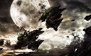
This artwork is another example from Foerster, which takes focus away from abstract and more to to creating an atmosphere. I can imagine once again the technique layering has been used, to combine the three different images - the moon, the clouds and the floating island - together to make a polished, complete piece. The contrast between the dark shadows of the breaking island and the brightness of the moon and clouds shows that he probably edited the lighting of separate layers and parts of the artwork through Photoshop, using Brightness settings and Contrast.
Unlike the last piece, I doubt much stamp tools or blurring has been used; blurring may have been used on the clouds to soften their colours together naturally, but it is not used as much as in the first piece. However, although very different both pieces are still very dramatic. I think this is down to the clever use of lighting and balancing a sharp contrast between light and shadow, despite the difference in the use of colour. This second piece is almost in sepia, apart from the light breaking through the clouds and the full moon, whilst the first piece seems to revel in using every colour together and making it work in an explosion against a dark canvas.
I think the way the second piece is also skewed onto its side also gives it a more disorientating view, giving more emotion to what is happening in the piece, more movement. This was probably easily achieved in Photoshop by using the angle-adjusting tool, or Free Transform.
The colours in the second piece are also interesting, to how the green shades in perfectly to the grey in the background. The gradients of the colour wheel he has used here is perfect, which really adds to the realistic feel of the piece.
Traditional Art

This traditional art piece was drawn by an artist named Anthony Christian. All his work is created using traditional means, and none of his portfolio has been edited by any digital programs.
This particular piece looks painted, as is his speciality. The use of colours against her face and clothes to create the shine of light against her works very well, with the background just shade darker than her skin to create that needed contrast of shadow. The portrait is as long as she, giving total focus to her as she fills the portrait; however, the focus is not directly in the centre, but to the right of the view. This gives a more casual, candid look and gives the painting a relaxed atmosphere, helped by a realistically content expression on her face. The shading on the artwork is soft and blended neatly, giving no sharp contrasts or lines in the work - once again adding to the gentle atmosphere.
The colour techniques here are subtle, but very effective. There is not a huge range of different colours here, the one colour that stands out is the light-blue of her turban. This is a welcome smear of colour, giving a splash of life and depth to the painting.
No comments:
Post a Comment